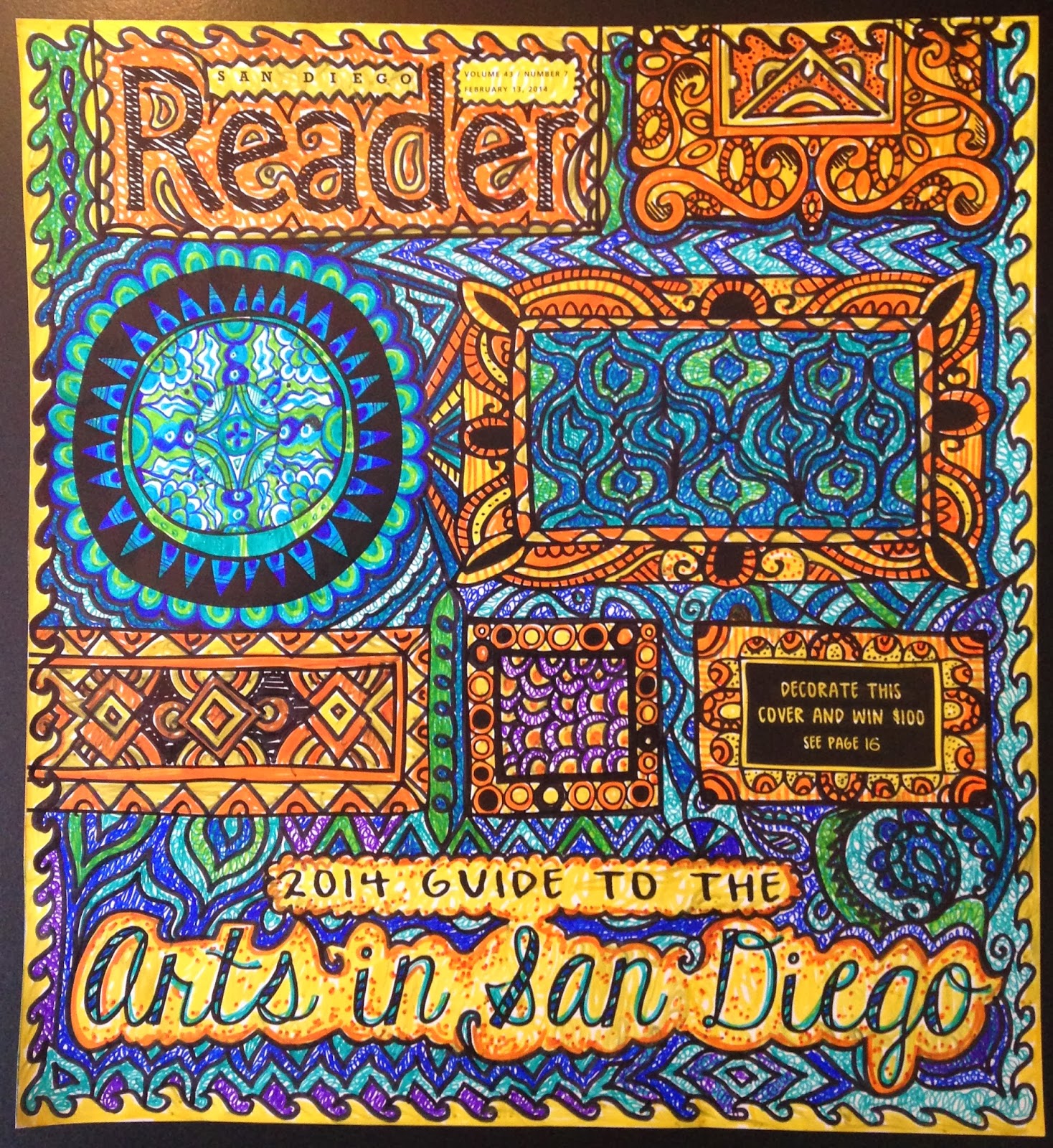
It seems I have another lesson under my belt. As usual it’s
one I learned the hard way.
I spent at least 2 hours today on an art submission for one
of the local magazines in town. I really liked my finished piece and submitted
it minutes before the deadline. Or so I thought.
Once I started double-checking the contest area of the
website, I realized that the deadline (which I was 99.9% sure was today) was
actually yesterday. Ahhhh, the fine print.
I’m actually not that bummed. I was a little annoyed as I
realized I’d missed the bus on the contest but the hours I spent drawing are not in vain. Any
creative time actually soothes the brain and I think I’m riding that wave of
calm right now.
I’ll still share with you the cover I did. But first a
little back story. The magazine offering the contest is The Reader, a free local paper put
out every Thursday. I’ve looked at it many times over the years. When I was scrounging around for art gigs in my early 20s, my artist
friend Todd and I used to look at The Reader weekly for work. They have a classified
section and each Thursday we’d open the paper and see if there was anything
between “aquarium” and “assembly.” “Art” came up at times but not as often as
broke artists like us would have liked.
The Reader is fun. It has great cover stories, restaurant
reviews, a section called "News of the Weird” (obviously an amusing part),
coupons and a column for almost any interest. I like its local vibe, I like that
the cover story always grabs my attention, and I love that they looked to the people
for the cover contest. I’m intrigued to see who wins it and has their cover
printed on next week’s issue.
There were 114 cover designs submitted. 15 were from one
artist! Wow. The reader gave two weeks lead time on the contest but still, 15
art pieces in 14 days is a lot. Some were very imaginative. One guy even carved
his from wood! Now there’s some thinking outside the box. In case you want to
see the other submissions, you can check them out here.
The cover had various frames drawn in black and white, and
people interpreted the assignment in a huge variety of ways. I think of mine as
a color and pattern extravaganza!
Here’s my take on the blank cover:

No comments:
Post a Comment